Follow Us
Contact Us
Common Web Design Mistakes Business Owners Make—and How to Fix Them
Let’s be real—designing a website can feel like a balancing act. You want it to look amazing, show off your brand, and wow every visitor. But sometimes, well-meaning choices (like making your logo gigantic or cramming everything you offer into the menu) can backfire. We’ve seen it all, and trust us, less is often more when it comes to great web design. Let's discuss some of the most frequent web design mistakes we encounter and explore smarter solutions to make your site stand out. At the end of the day, our role is to enhance your website's brand awareness, drive more leads, serve as a valuable resource, and ultimately boost your business.
Quick Summary:
- Big Logos - ummm...not the best idea
- Clean and lean - avoid clutter
- Fonts....don't try them all
- How to make your hero an actual hero
- Call to action - we're passed the click here stage
- Old school is cool - but sleeker is the way to go
- Must Find Balance Daniel-son
Why Bigger Isn’t Better: Right-Sizing Your Logo
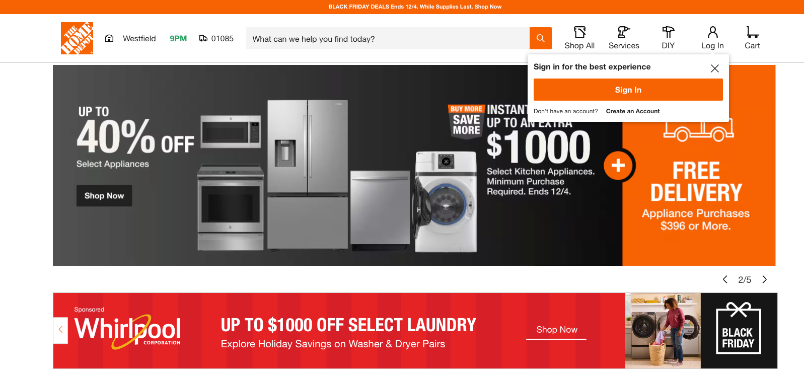
One of the most common requests we get is: “Can we make the logo bigger?” Trust us, you’re not alone! It’s totally understandable—your logo represents your brand, and you want it front and center. But here’s the thing: if you look at major websites like Amazon, Home Depot, or even Target, you’ll notice something interesting. Their logos? Off to the left, crisp, and not taking up a ton of space.
That’s not a coincidence; it’s a strategy. Keeping the logo smaller and tucked neatly to the side ensures your header stays clean and user-friendly. It also leaves plenty of room for the things that really matter—like an easy-to-find navigation bar, a search feature, or even your call-to-action button.
We understand the temptation to let your logo dominate the page—it's the emblem of your brand identity, the visual that ties your business together. We too think our logo rocks and want people to just sit back and be like "wow!". But here's the thing--your logo is just one piece of a larger puzzle. Your website should be an experience, and that means giving other elements room to shine.
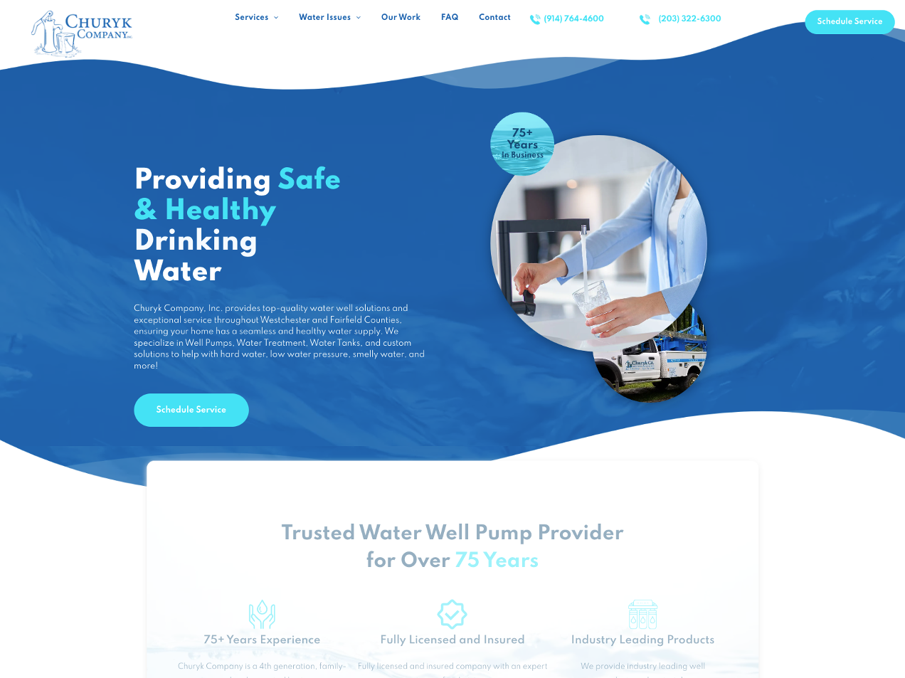
Don’t Let Fonts Have a Free-For-All: Keep It Clean and Consistent
Another popular request we hear is: “Can we use this fun font for the headlines and this other one for the text? Oh, and maybe a different one for the buttons?” We get it—there are so many cool fonts out there, and it’s tempting to use them all. But let’s take a step back and look at the big picture.
Think of major companies like Apple or Google. They don’t overwhelm visitors with a font circus. Instead, they stick to 2–3 complementary fonts that work together to create a clean, professional look. Why? Because consistent typography helps guide the reader’s eye and creates a cohesive design that feels intentional, not chaotic.
When too many fonts are competing for attention, it can make your site feel cluttered and hard to read. Plus, switching between fonts can slow down your site’s loading time—a big no-no when every second counts in keeping a visitor’s attention.
The key is to pick a font family that reflects your brand’s personality and use it strategically. Headlines? Bold and easy to scan. Body text? Simple and readable. Buttons? Clear and action-oriented. This way, your content shines, your message is clear, and your site feels as polished as your business deserves.
(And hey, if you’re attached to that quirky font, maybe we can sneak it in for a fun accent here or there—balance is everything!)
The Hero Image Trap: Why Speed and Strategy Beat Big and Flashy
“We need a huge, full-screen image right at the top of the page!” Sound familiar? It’s a super common request, and we get it—who doesn’t want to wow visitors with a bold first impression? But here’s the catch: those massive, unoptimized hero images can slow your site down and frustrate your audience before they even get to see what you’re all about.
Look at sites like Airbnb or Shopify. Sure, they use big visuals, but those images are optimized, purposeful, and paired with clear messaging. A hero image isn’t just about showing off a pretty picture—it’s about drawing users in while keeping your site fast and functional.
Here’s our advice: choose a high-quality image that represents your brand, but keep it lightweight and fast-loading. Pair it with a concise, compelling headline and a call-to-action that invites visitors to take the next step. Bonus points if your image is relevant and connects emotionally with your audience—it’s about telling a story, not just filling space.
So yes, hero images are awesome—but like any superhero, they work best with a solid strategy behind them. Let’s make sure yours saves the day and your site’s performance!
Call-to-Actions That Actually Work: Saying Goodbye to 'Click Here'"
When it comes to call-to-actions (CTAs), we often hear, “Can we just say ‘Click Here’ or ‘Learn More’?” Sure, those phrases are simple, but they’re also...well, kind of boring. They don’t inspire action or tell visitors what to expect next.
Take a look at successful sites like Slack or HubSpot. Their CTAs are tailored and specific, like “Get Started for Free” or “See How It Works.” These phrases not only guide users but also set expectations, creating a clear path for them to follow.
Our advice? Be direct and action-oriented. Instead of “Click Here,” try “Schedule Your Free Consultation” or “Shop Our Latest Collection.” It’s all about helping visitors know what they’re getting while nudging them to take that next step.
Why Modern Design Matters: Ditching Outdated Features for a Sleeker Look
Yes we get it - the cool 25 second video you have with narration and draws out a storyline is cool! Same with some image rotators and sliding panels! But while those features may seem impressive, they can actually harm your site’s user experience.
Modern design is all about simplicity and functionality. That means ditching outdated features that slow down your site or distract from its purpose. Instead, focus on clean layouts, intuitive navigation, and fast-loading pages.
Think of sites like Dropbox or Asana—clean, straightforward designs that put the user first. They’re not cluttered with bells and whistles; they prioritize usability over flashy gimmicks. And guess what? Users appreciate it.
"Find Balance," as Mr. Miyagi Would Say
As web designers in Massachusetts, we’re all about bringing your brand’s personality to life online. It’s our job to sprinkle in those creative elements that make your website feel unique and memorable. But here’s the thing—too much design, or trying to cram in every idea at once, can actually distract from what your site is meant to do. Balance is key, just like Mr. Miyagi said.
At its core, your website is your digital storefront. It’s where people learn who you are, what you offer, and why they should choose you. A well-designed site should make it easy for visitors to find the information they need, guide them toward taking action, and—let’s be honest—make you look like the rockstar business you are. When we talk about simplifying or streamlining certain elements, it’s not about holding back your creativity; it’s about making sure your message isn’t buried under unnecessary clutter.
Think of simplicity as a power move. Clean, intuitive design doesn’t just look good—it works. It helps turn visitors into leads, boosts sales, and gives customers the confidence to trust your business. It’s like giving them a smooth path to your front door, rather than sending them through a maze.
Listen—we love pagers and Nintendo Power Gloves as much as the next 90s kid, but let’s be honest: running your business with them today wouldn’t get you very far. The same goes for outdated web design trends. It’s time to ditch the clutter and embrace sleek, modern design that puts your brand and your users front and center.
We live in a different time—kids scroll through thousands of pages a minute, and most of us barely have the attention span to read past a headline. Your website needs to grab attention fast, guide users effortlessly, and deliver the goods without making them think twice. If you're ready to get away from the floppy disks and move into cloud storage - give us a shout!
Time to leave the old school design world. We know it's hard - but we're here when you're ready

Listen—we love pagers and Nintendo Power Gloves as much as the next 90s kid, but let’s be honest: running your business with them today wouldn’t get you very far. The same goes for outdated web design trends. It’s time to ditch the clutter and embrace sleek, modern design that puts your brand and your users front and center.
We live in a different time—kids scroll through thousands of pages a minute, and most of us barely have the attention span to read past a headline. Your website needs to grab attention fast, guide users effortlessly, and deliver the goods without making them think twice. If you're ready to get away from the floppy disks and move into cloud storage - give us a shout!
Questions? Have a project you're ready to launch?
Simply text our team at
(857) 256-1295 or send us a message!
Latest Articles

SERVICES
RESOURCES
ONBOARDING