Follow Us
Contact Us
3 Essential Tips for Making a Minimalist Website Design
Ryan Stack • August 11, 2020
With many things happening around the world, many people crave simplicity and ease. They want things to be straightforward and purposeful, especially when it comes to designs. Minimalist designs have no distractions. Everything you see is friendly to the eyes, fundamental, and essential. If you’re aiming for a clean and minimalist website design, we have three tips to help you start.
What Is Minimalism in Website Design?
When it comes to website design, using simple forms does not always mean that your web page is already minimalist. In essence, your design should be able to convey a message without too many distracting elements. Nothing should make you lose your focus, nor make you divert your attention to something else.
More people prefer a minimalist design to websites and applications because they are user-friendly and visually appealing.
How to Make a Minimalist Website
Tip 1: Make all details significant
Every detail they’ll see on your website should have a purpose. If you only include an element as added visual, but without a function, you might need to reconsider. Ask yourself if it is essential or will only add clutter to your work. At a glance, the site visitors should be able to identify your hero image and hero text.
Adding Images
Having one image on a page would be good enough for a minimalist site. Instead of seeing it as a boring piece, consider it as your site highlight. If using only one image looks monotonous for you, you can explore adding a video instead.
Adding Texts
Words are the best and fastest way to communicate a message to a reader; however, when it comes to web design, texts are also one of the designer’s biggest struggles. Too much text can be overwhelming for site visitors. Seeing long texts on your homepage can lead to a high bounce rate. To avoid this, only use short texts and include essential information. Instead of putting everything on your homepage, you can place your descriptions to other navigation pages.
Adding Graphics
All your added graphic elements should have the following purpose:
- Act as a shape divider or the shape that separates sections of your pages
- Helps user’s eyes to navigate easily within the page
- Highlights a piece of information on the site
Added elements can help enhance the appearance of a website, but functionality is more important when it comes to minimalist web designs. The same goes for your website background. Only use flat design for your background, so the site visitors know where to focus their attention.
Tip 2: Be wise with how you use colors
Color plays a vital role on a website. Each conveys an emotion or message and helps highlight the essential features of the site. However, you might notice that most minimalist web pages use monochromatic colors. They often play around two to three colors only.
When designing a minimalist style website, you need to choose which elements to add colors to carefully. Don’t also forget to add contrast so the other colors can stand out. Most websites use white so that the different colors would pop up. Carefully choose a palette that can deliver your message well.
Tip 3: Add more negative space
Negative space refers to the blank space you see on the site around the subject. This feature is the most significant element in minimalist web design because it helps the eyes navigate toward the essential aspects. It also gives that “breathing space,” making the whole site feel roomy.
Conclusion
A website becomes minimalist when only essential elements are found inside it. This design style has become popular over the years because of its functionality and ease of use. Apart from highlighting the vital message and elements of the site, a clean design could also help people stay longer because of its simple interface.
If you’re looking for web design companies
to help you achieve a minimalist website design, we can do that for you. We are a web design and marketing agency that specializes in modern and professional web design. Contact us to learn how we can help.
Questions? Have a project you're ready to launch?
Simply text our team at
(857) 256-1295 or send us a message!
Latest Articles
By Ryan Stack
•
March 12, 2025
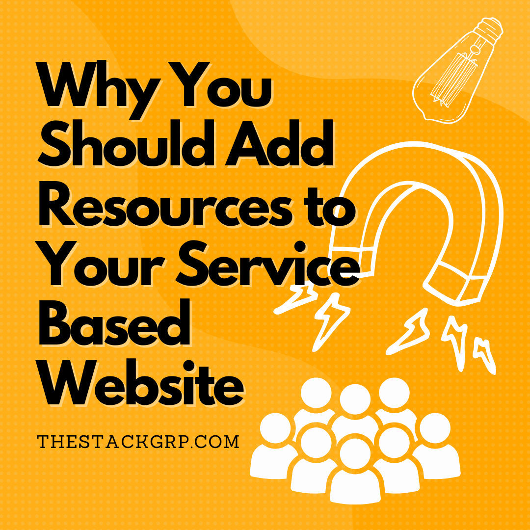
Most small business websites focus on one thing—listing services. While that’s important, it’s not enough to drive consistent traffic, keep visitors engaged, or turn them into paying customers. Learn why you should consider adding resources and blog articles to your website.

By Jordan Stack
•
January 31, 2025
Your website is often the first impression potential customers get of your business. If it looks outdated, runs slowly, or lacks modern features, visitors may leave before they even get to know what you offer. As technology advances, websites that haven’t been updated in years can feel clunky and out of touch. In 2025, a fresh website redesign isn’t just about aesthetics—it’s about staying competitive, improving user experience, and taking advantage of new technology.

By Jordan Stack
•
January 31, 2025
Expanding your e-commerce business beyond your home state isn’t just about reaching new customers—it’s about creating the perception of a larger, more established brand. When customers across different regions find your store in search results, it fosters trust, increases brand authority, and positions your business as a national or even global competitor. Out-of-state SEO is the key to making that happen.
SERVICES
RESOURCES
ONBOARDING